Resona was a concept project focused on exploring modern UI directions for a podcast application. The aim was to experiment with visual styles and layouts that could enhance the audio-listening experience while giving the interface a distinct and memorable identity. Instead of focusing on complex user flows, the project centered around UI exploration—particularly the use of glassmorphism and dynamic, sound wave–inspired shapes to reflect the rhythm and energy of podcasts. The result is a design that feels immersive, modern, and visually tied to the essence of audio.
B
Design Goals
The project was an exploration in balancing creative visual expression with functional clarity, pushing the boundaries of what a podcast interface can feel like while keeping the user front and center. I aimed to design an interface that not only looks contemporary but also reflects the essence of audio through dynamic, sound wave–inspired shapes, creating a subtle visual rhythm tied to the listening experience. At the same time, I prioritized clear hierarchy and usability, ensuring that even with experimental visuals, users can navigate effortlessly, discover content quickly, and engage with the app intuitively.
C
Concept Exploration
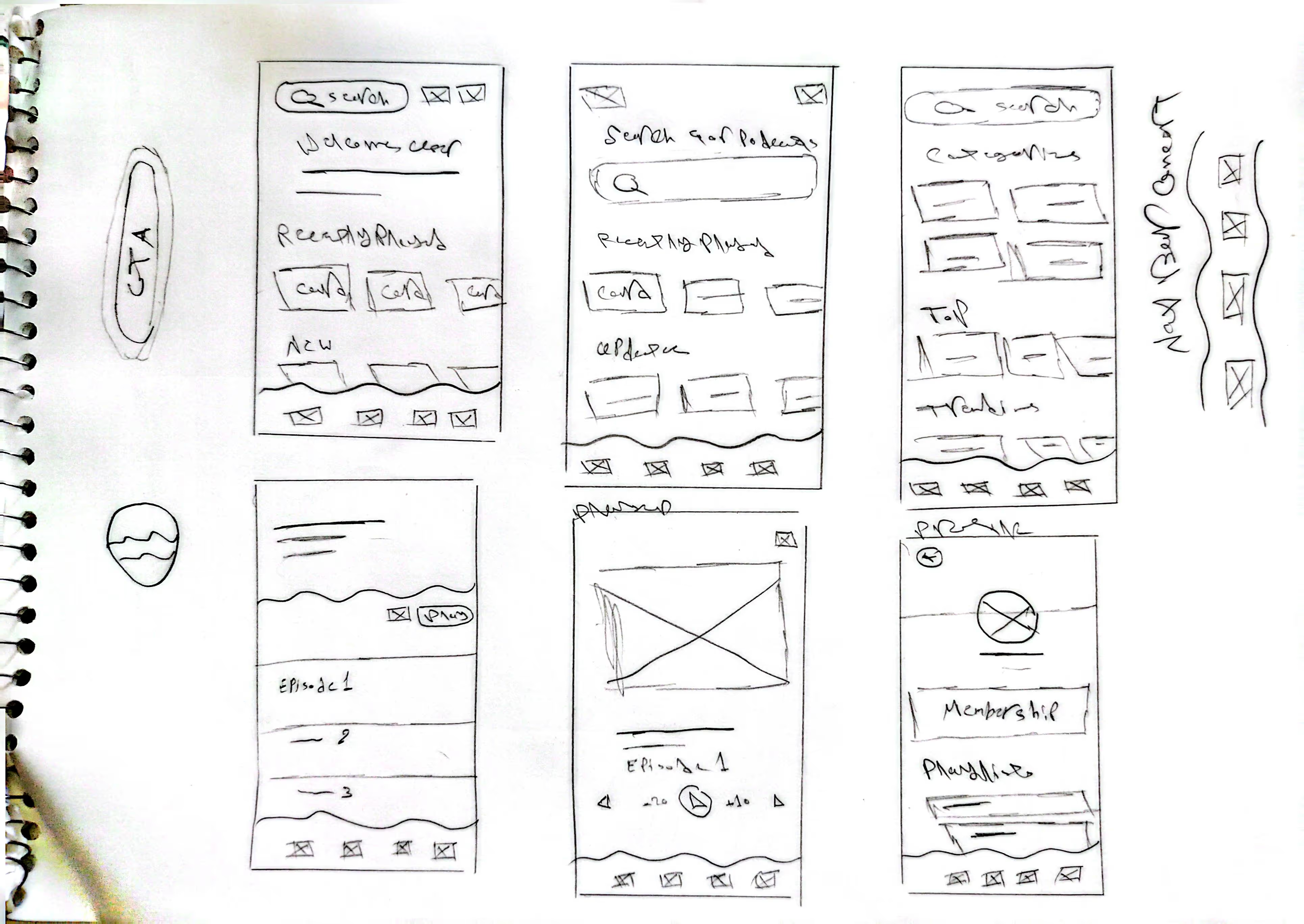
I explored multiple layout ideas and visual treatments through early sketches. These rough concepts allowed me to experiment freely with sound wave–inspired elements, glassmorphism effects, and content hierarchy, helping me quickly iterate and refine the visual direction.
To ensure the interface feels intuitive despite its experimental visuals, I mapped out the key user flows for the podcast experience. This step helped me visualize navigation, content discovery, and playback interactions, making sure that users can easily find and engage with episodes while the UI experimentation remains functional and approachable.
D
Style Guide
The color palette for Resona was carefully selected to convey energy, modernity, and clarity. combining deep purple with vibrant pink, creating a bold and modern visual identity. The contrast between these colors highlights key actions and interactive elements, while maintaining clarity and visual hierarchy. This pairing brings energy and personality to the app, reflecting the dynamic rhythm of audio content while keeping the interface approachable and engaging.
Colors
Deep Purple
#3A0CA3
Vibrant Pink
#F72585
Crayola
#FF773D
Sage
#C5C392
Eerie Black
#191716
Gray
#E4E4E7
Typography
For typography, I chose Raleway typeface for its modern, clean, and highly readable style. It complements the bold color palette and contemporary visual design, while ensuring that titles, labels, and content are easy to scan. This clarity is especially important for a visually dynamic podcast interface, helping users navigate and engage with content effortlessly.
E
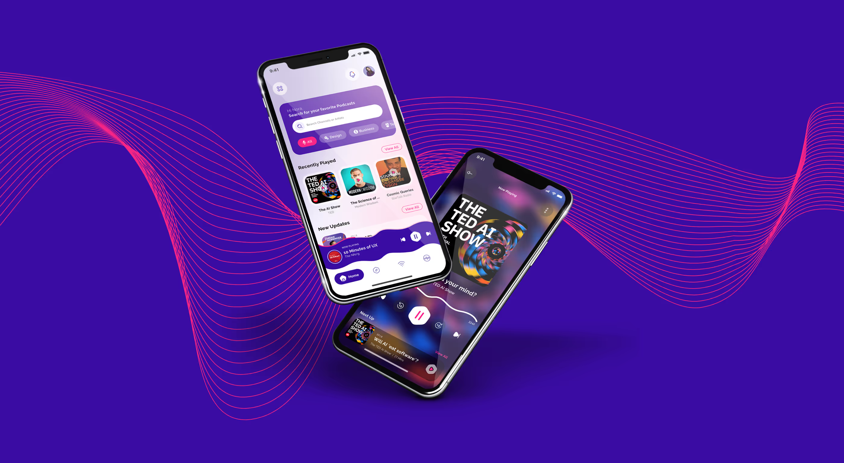
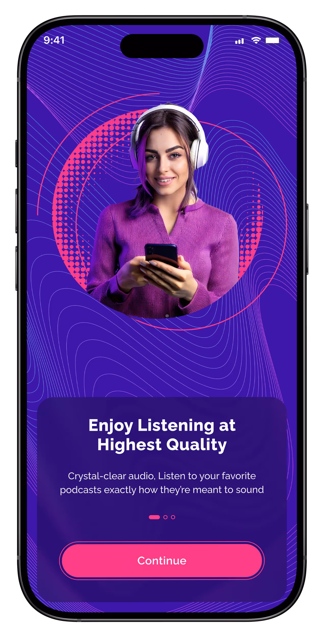
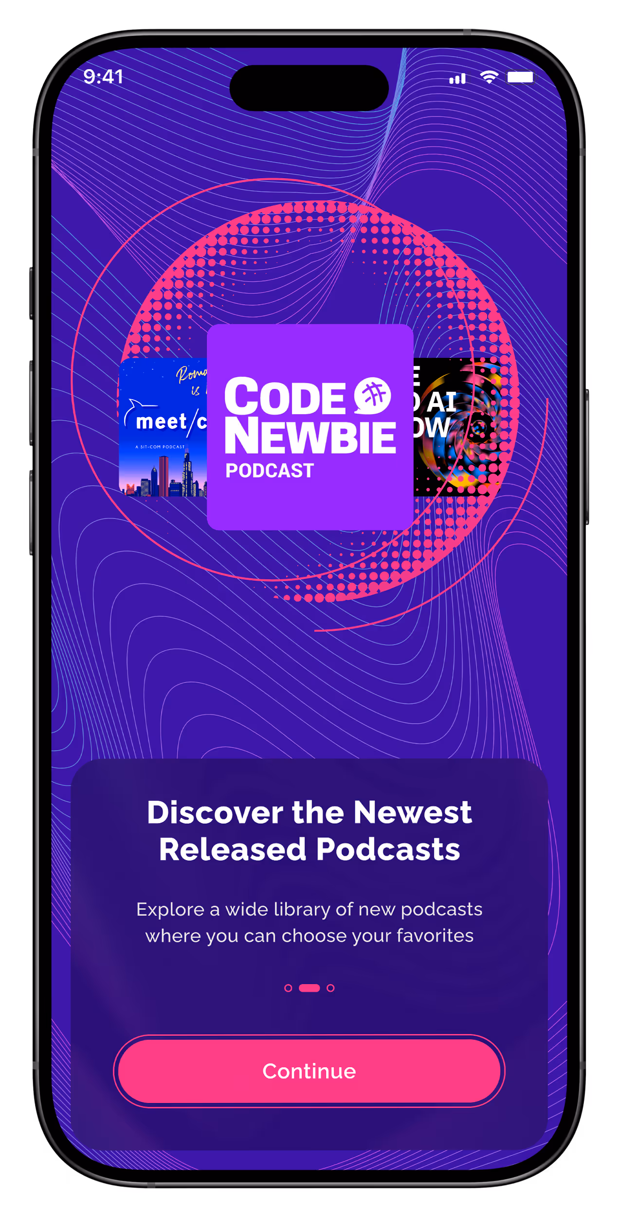
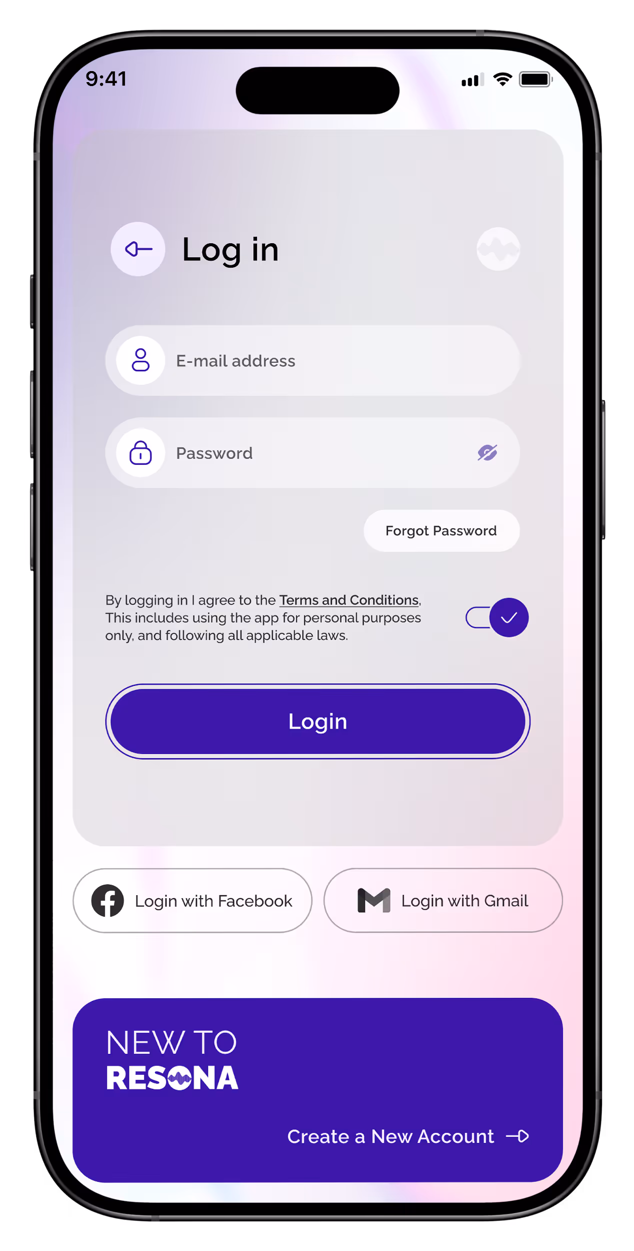
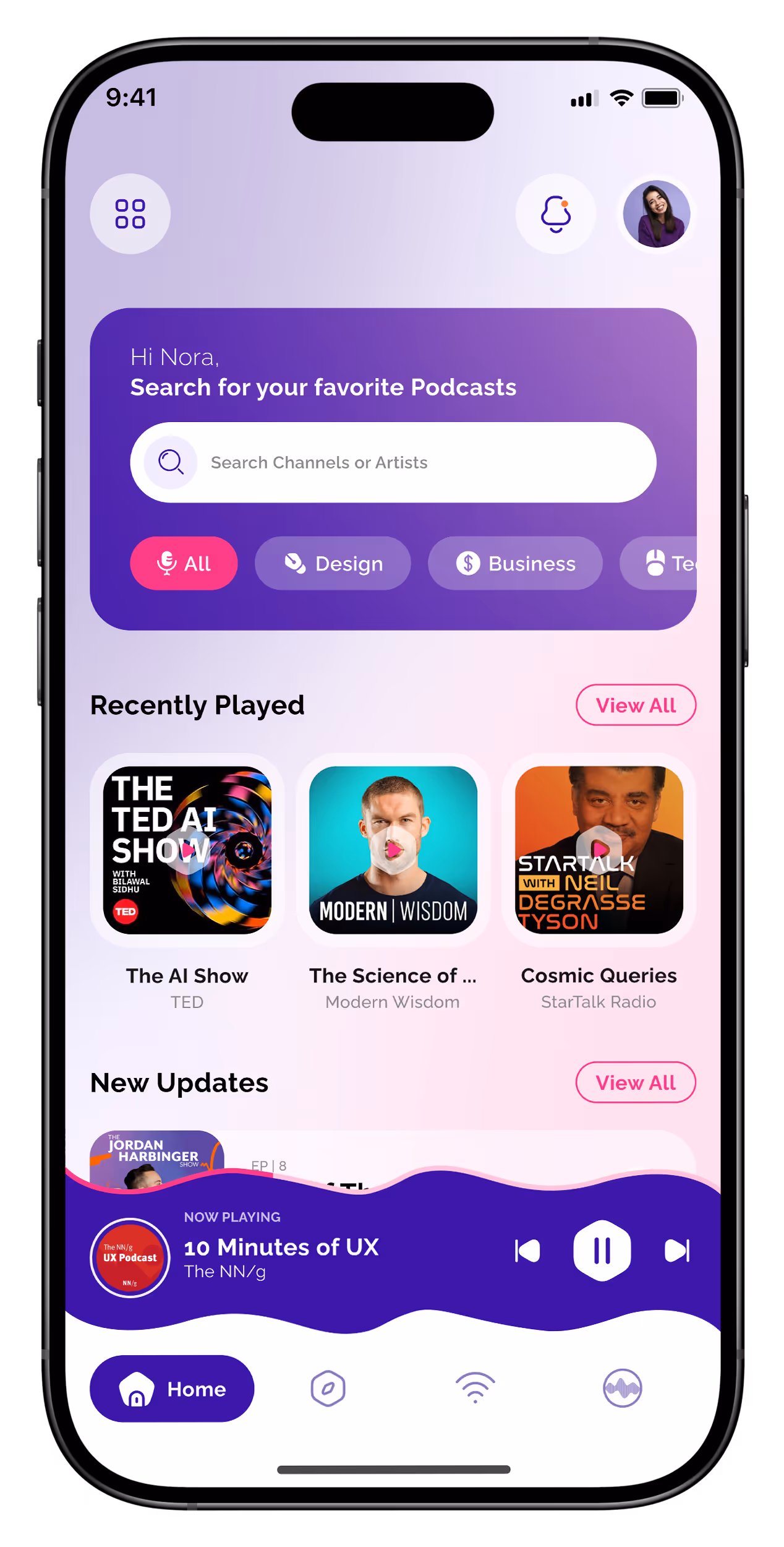
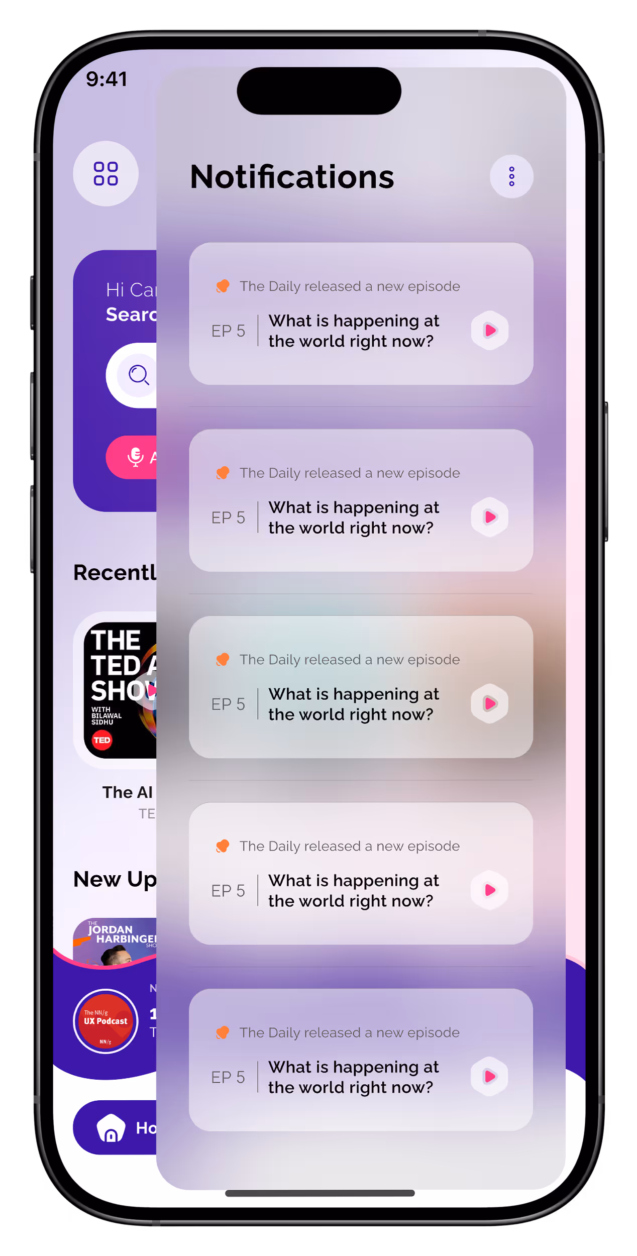
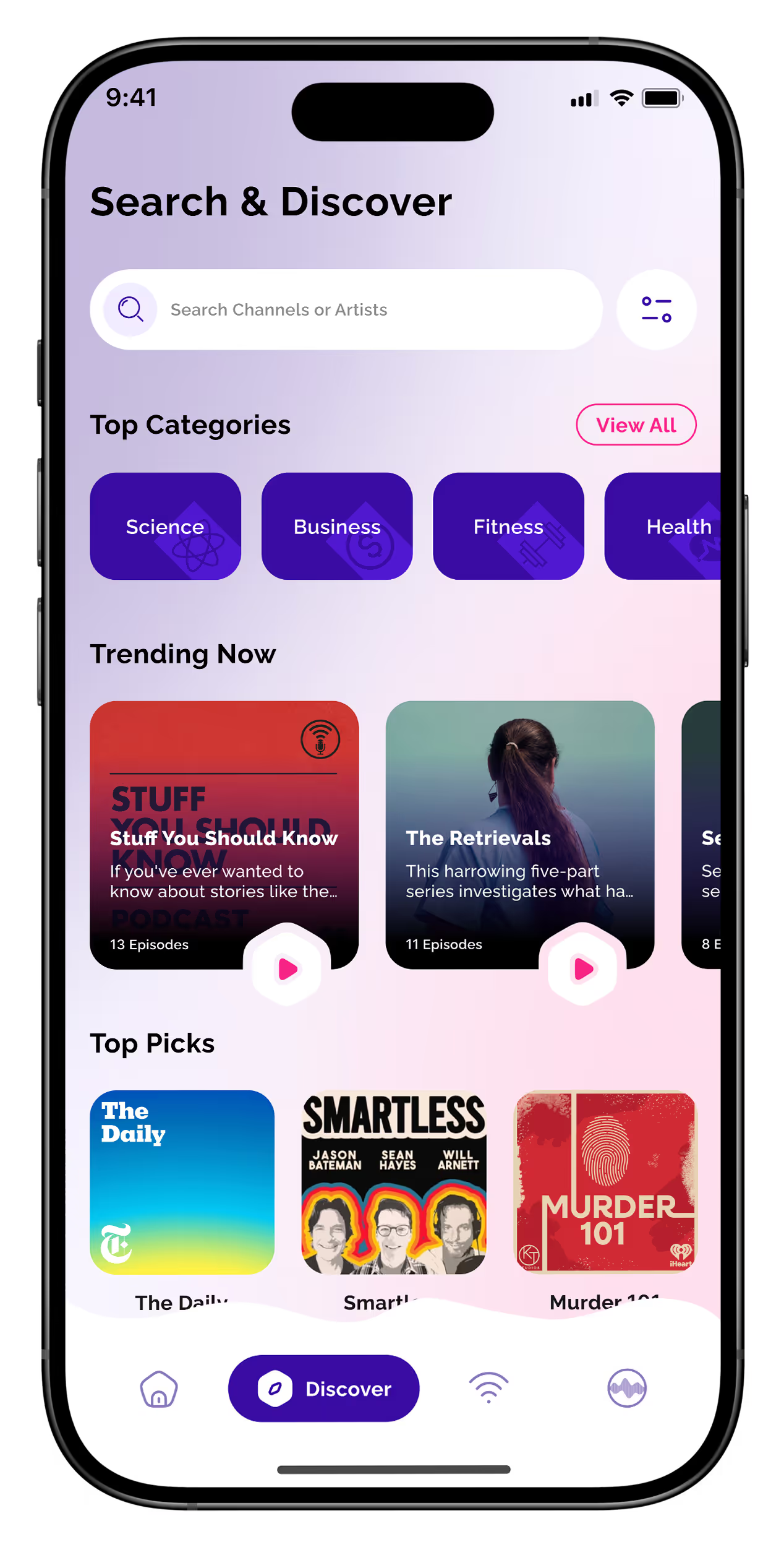
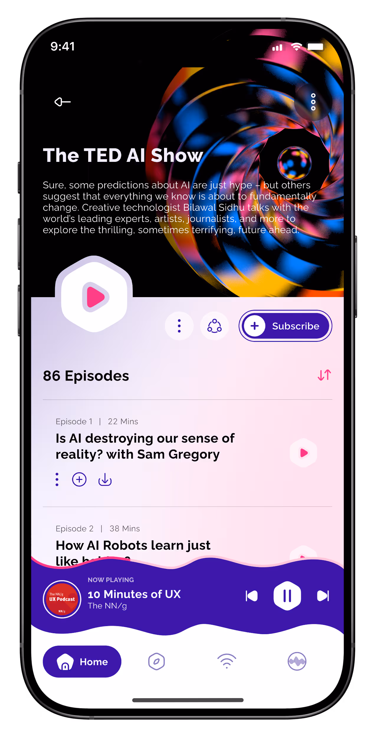
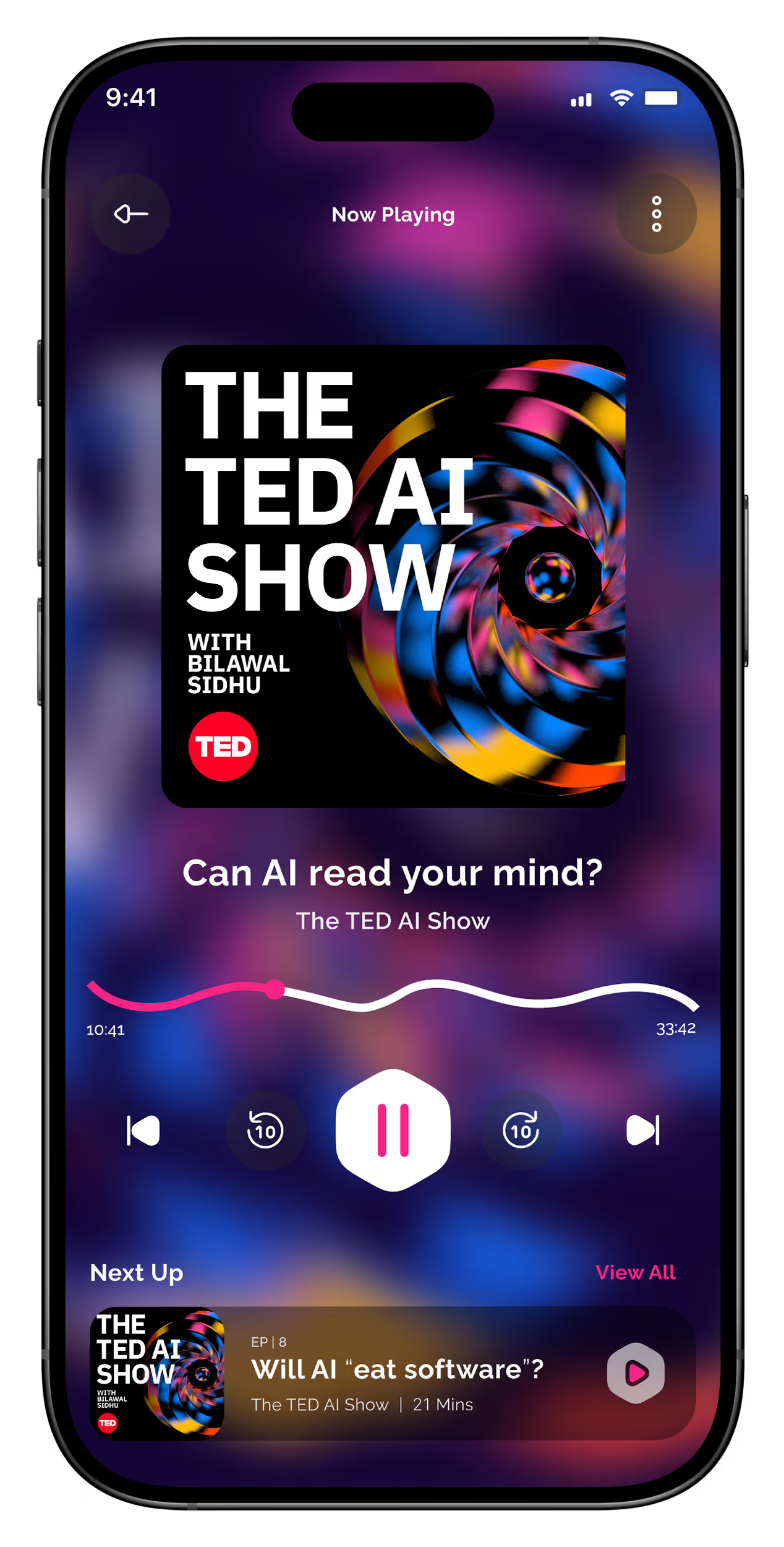
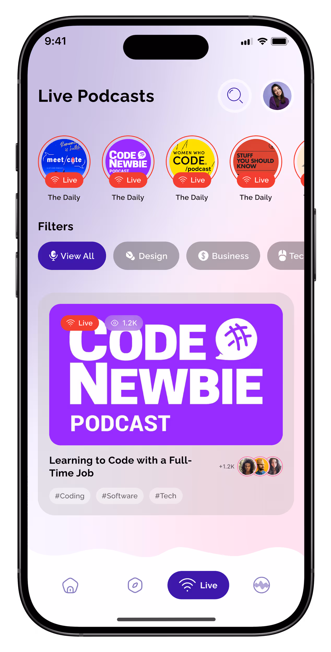
UI Design
With the visual direction, color palette, and typography established, I translated the concepts into high-fidelity screens. The focus was on creating a modern, engaging, and user-friendly interface that reflects the energy of audio content. By experimenting with glassmorphism, layered depth, and sound wave–inspired shapes, the design emphasizes clarity, hierarchy, and intuitive interaction, while giving the app a distinctive and immersive visual identity.
F
Takeaways
This project was a valuable exploration of modern UI trends and concept-driven design. Working on Resona reinforced the importance of creating interfaces that are visually striking yet highly readable, where bold visual experimentation doesn’t compromise clarity or usability. Most importantly, the project emphasized that UI exploration is not just about aesthetics, but also about crafting an experience that communicates the essence of the product and engages users from the first glance.
Let's Connect
Hit me up — for jobs, chats, or even ancient mysteries!